Freeway

Re-imagining flight bookings at Cleartrip by prioritizing speed, ease of use, and user delight.

Cleartrip - Home page
Cleartrip - Seat Ancillaries
Cleartrip - Booking Confirmation

Introduction: Riding the wave of travel revival

In 2022, as the world rebounded from the pandemic, India witnessed a surge in travel known as "revenge travel," where eager travelers sought to reclaim lost time and missed adventures. This surge reshaped the airline market, yet the online booking sector remained stagnant, trapped in a cycle of price-based competition.

At Cleartrip, India's second-largest OTA, innovation is in our DNA. Strengthened by our partnership with Flipkart, we saw a chance to revolutionize travel booking. Our aim? To harness this renewed travel enthusiasm and introduce user-focused innovations. We didn't just want to offer deals; we aimed to become the go-to platform for an unparalleled booking experience.

Following my NDA, I've left out or tweaked any sensitive info in this case study. What you read here comes from my own insights and might not exactly match Cleartrip's official stance.

Following my NDA, I've left out or tweaked any sensitive info in this case study. What you read here comes from my own insights and might not exactly match Cleartrip's official stance.

Spotting hurdles in flight reservations

As we kicked off this project, it felt like we were venturing into the unknown, with only a vague idea of where we wanted to go. We were flying blind, aiming to create something entirely new and different. So, I reached out to friends, colleagues, and family for some grassroots-level research to understand the challenges of booking flights online.

As we kicked off this project, it felt like we were venturing into the unknown, with only a vague idea of where we wanted to go. We were flying blind, aiming to create something entirely new and different. So, I reached out to friends, colleagues, and family for some grassroots-level research to understand the challenges of booking flights online.

Here’s what we found out on a high-level:

Here’s what we found out on a high-level:

🤯

🤯

Expanding Cleartrip’s user base

Following Flipkart's acquisition of Cleartrip, we shifted our focus to target a broader audience, including budget-conscious travelers. Through thorough research, we identified two primary personas reflecting Cleartrip's new target demographic:

User persona - Savvy Saver

Savvy Savers

Budget-conscious travelers who prioritize affordability and are flexible with their travel plans for a better deal.

User persona - Savvy Saver

Savvy Savers

Budget-conscious travelers who prioritize affordability and are flexible with their travel plans for a better deal.

User persona - Comfort Crusader

Comfort Crusaders

Time and convenience-driven travelers who are willing to invest more for added comfort and convenience.

User persona - Comfort Crusader

Comfort Crusaders

Time and convenience-driven travelers who are willing to invest more for added comfort and convenience.

Defining the challenge with a design sprint

With everyone in the company having different visions for this "solve everything" project, aligning our goals was our first challenge.

I teamed up with Swati, a fellow designer, to embark on a Google GV design sprint. Our journey began with a thorough discussion on the week's objectives. We aimed to address two overarching questions:

1

How might we simplify & expedite the booking process, reducing it to just 1/5th of the current time?

1

How might we simplify & expedite the booking process, reducing it to just 1/5th of the current time?

2

How can we set Cleartrip apart in a crowded market and establish ourselves as a market leader?

2

How can we set Cleartrip apart in a crowded market and establish ourselves as a market leader?

With our goals in sight, we dove into expert interviews and how might we sessions to gather insights from diverse perspectives. While we encountered initial hurdles, the Crazy 8’s sketching session provided a platform for creative exploration. Subsequently, lightning demos offered a glimpse into both practical and aspirational industry practices, shaping our strategy moving forward.

Design sprint
highlights

Design Sprint - Whiteboarding
Design Sprint - Card Sorting
Photo of Harsha and Cleartrip Design Colleagues

Design sprint
highlights

Design Sprint - Whiteboarding
Design Sprint - Card Sorting
Photo of Harsha and Cleartrip Design Colleagues

Crafting concepts from chaos

Ideation was a cycle of divergence and convergence. We'd sketch out ideas, gather to discuss, then iterate and refine. From user flows to UI concepts, we explored a spectrum of possibilities. By the end of the week, we distilled our efforts into a handful of promising concepts—those that were feasible, testable, and impactful.

Our goal was clear: Pursue novelty and explore extensively

Organising flights as per user preferences

Working with the knowledge that most travelers prefer non-stop flights, we honed in on what matters most to our users: price for the budget-aware 'Savvy Savers' and departure time for the convenience-focused 'Comfort Crusaders.' This understanding inspired a fresh approach to how we display flights.

Pen & paper wireframe sketch of Search Results Page

Search Results Page Concept 1

For the budget conscious,

flights were grouped by price,

showing only departure times

Pen & paper wireframe sketch of Search Results Page

Search Results Page Concept 2

For the time-sensitive,

flights were sorted under time ranges catering to those with specific time preference

Making booking a breeze: Less hassle, more clarity

To simplify the booking journey, we streamlined the process from 9 steps down to 5. Traveler selection now appears earlier, on the third step instead of the seventh, with add-ons offered based on user preference rather than obligation.

To alleviate booking stress and ensure clarity, we introduced a consistent boarding pass-like format across the booking journey. This unified structure provides users with clear identification at every step.

Pen & paper wireframe sketch of Itinerary page

Step 3 / 5

Review flight &

add travellers

Review flight & add travellers

Pen & paper wireframe sketch of Itinerary with Ancillaries

Step 4 / 5

Select add-ons (optional), make payment

Select add-ons (optional), make payment

Pen & paper wireframe sketch of Booking Confirmation

Step 5 / 5

Get the final boarding pass

Get the final boarding pass

Making booking a breeze: Less hassle, more clarity

To simplify the booking journey, we streamlined the process from 9 steps down to 5. Traveler selection now appears earlier, on the third step instead of the seventh, with add-ons offered based on user preference rather than obligation.

To alleviate booking stress and ensure clarity, we introduced a consistent boarding pass-like format across the booking journey. This unified structure provides users with clear identification at every step.

Pen & paper wireframe sketch of Itinerary page

Step 3 / 5

Review flight &

add travellers

Pen & paper wireframe sketch of Itinerary with Ancillaries

Step 4 / 5

Select add-ons (optional), make payment

Pen & paper wireframe sketch of Booking Confirmation

Step 5 / 5

Get the final boarding pass

Testing & concept validation

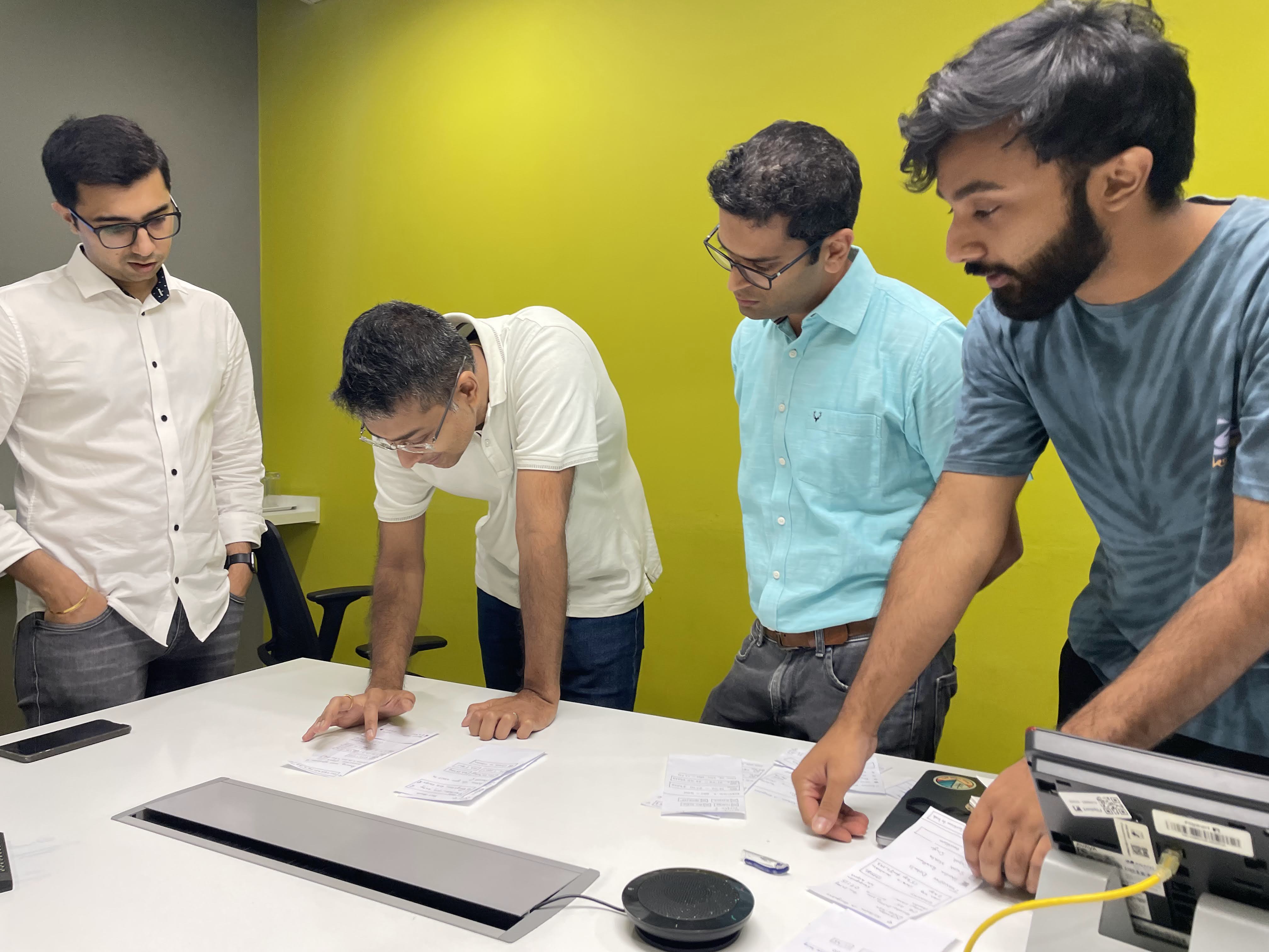
After sketching out concepts and crafting a prototype with paper cut-outs for rapid iteration, it was time to validate these ideas with real users. This approach not only sped up the testing process but also received nods of approval for its efficiency across the board.

We conducted over 15 in-person usability tests across the 18-40 age spectrum, tapping into a diverse pool of individuals, including IT professionals, college juniors, friends' parents, and volunteers from online platforms, ensuring a balanced mix of gender, qualifications, and tech proficiency.

With multiple concepts in hand, some quite novel and fresh, our aim with testing was to see what resonated with users and if any patterns or insights emerged.

Usability Testing session in office with participant
Usability Testing session in office with participants

Test, Iterate, Repeat.

The task was simple: booking a flight from Bangalore to Kolkata. This evaluated the prototype's intuitiveness, spanning various touchpoints from search to selection to booking.


After each round of testing, I refined the prototype based on feedback, honing our concept with real-world insights. We iterated tirelessly, polishing the design until the feedback became consistent. At that point, we knew the design had reached a stage where it resonated with everyone involved.

Pen & paper wieframe with modifications after Usability Testing

Flight Details · Concept 1.3 (Paper)

Moved add-ons up from payment to details.

Moved add-ons up from payment to details.

Moved add-ons up from payment to details.

Digital Wireframe of Search Results Page

Search Results · Concept 1.4 (Digital)

Switched to price ranges with duration filters

Switched to price ranges with duration filters

Switched to price ranges with duration filters

Search Results · Concept 5 (Digital)

Combined both preferences with a toggle

Combined both preferences with a toggle

Combined both preferences with a toggle

Insights from the research

Insights from the research

Insights from the research

Mobile dominance

Users favored mobile apps for convenience and easy payments.

Demographic trends

Weekends were preferred by working professionals, while weekdays were favored by students for cheaper flights.

Timing matters

Morning flights were popular for efficient use of the day, while safety concerns arose

Time format confusion

Users struggled with the 24-hour time format, despite its widespread industry use.

Timing matters

Morning flights were popular for efficient use of the day, while safety concerns arose

Time format confusion

Users struggled with the 24-hour time format, despite its widespread industry use.

Learning from missteps

A few of our ideas had missed the mark. The date picker widget, intended to highlight optimal travel dates, didn't quite resonate with users, ending up in the 'thanks, but no thanks' pile.

Similarly, our 'Primary Traveller' setup, aimed at simplifying sharing booking details with a star icon, also fell short.

What's interesting is the process of convincing the team, especially a product manager invested in the 'Primary Traveller' feature, to let go based on user feedback. It sparked debates and deliberations, but ultimately, we decided to include it in the initial release and closely monitor its reception among our audience. Sometimes, the road to innovation involves taking these small gambles, all in the pursuit of learning and adapting.

The birth of Clear Design System

Embarking on a journey to refresh Cleartrip's outdated and inconsistent mobile design, I saw the perfect moment to craft a unified visual language. This vision birthed the Clear Design System (CDS), a keystone for design coherence across the board.

Driven by a blend of necessity and passion, I took it upon myself to develop the CDS alongside my work on the Freeway project—a self-initiated endeavor to infuse Cleartrip with a new sense of vibrancy. For an in-depth look at how this project unfolded, click the button below.

UI components
UI components
UI components
UI components
PRESENTING
PRESENTING

A fresh new

A fresh new

A fresh new

cleartrip

cleartrip

cleartrip

Transformed by the Clear Design System

Transformed by the Clear Design System

Freeway - New Homepage

A home page designed for you

Say goodbye to typing your origin city—auto-detect makes it effortless. Get to your favorite places faster with personalized suggestions.

Simplified city selection

Fewer Clicks, Faster Results

Freeway - Search Experience

Simplified city selection

Fewer Clicks, Faster Results

Freeway - Search Experience

Colour-coded price calendar

Set Realistic Expectations

Freeway - Colour coded calendar

Colour-coded price calendar

Set Realistic Expectations

Freeway - Colour coded calendar

A no-nonsense Details page

Freeway - New Itinerary page - Akasa flight
Freeway - New Itinerary page - Indigo flight
Freeway - New Itinerary page - Vistara flight

New Details,
new features

Primary traveller

Simplifying booking details sharing with a star icon

Adding new traveller

Fare options

Get all the details you need to make informed decisions

Fare selection card
Fare selection card
Fare selection card
Fare selection card
Fare selection card
Fare selection card

Coupons

Improved visibility, a bold and engaging upgrade

New coupon application experience

Enhanced add-ons experience

Streamlined grouping. Discover all add-ons consolidated under one umbrella for seamless navigation and upfront discovery.

Streamlined grouping. Discover all add-ons consolidated under one umbrella for seamless navigation and upfront discovery.

Streamlined grouping. Discover all add-ons consolidated under one umbrella for seamless navigation and upfront discovery.

Tailored for every traveler. Personalize your trip like never before by allocating seats, meals, and baggage to each individual traveler

Tailored for every traveler. Personalize your trip like never before by allocating seats, meals, and baggage to each individual traveler

Tailored for every traveler. Personalize your trip like never before by allocating seats, meals, and baggage to each individual traveler

Payment was never so seamless

Know what you're booking, always.

Seamlessly integrated into the payment page, the boarding pass ensures clarity and alleviates booking stress.

Use Flipkart SuperCoins & Gift Cards

Favourites up top

Easily access all preferred payment methods upfront for seamless transactions.

New redesigned payment page

A more functional confirmation

Watch the sky change colors based on your booking's departure time.

Discover tailored hotel suggestions with personalised offers just for you.

New booking confirmation page

Add free cancellation and date change for a limited time after booking.

A more functional confirmation

Freeway goes live!

To tackle the monumental engineering effort of revamping the entire journey, we recognized the need for a phased approach.

We initiated the rollout with the introduction of the new flight details page and revamped add-on experience. However, our phased approach resulted in a fragmented user experience as essential sections such as the homepage, search results, payment, and confirmation pages retained their outdated design.

To assess its impact, Freeway was initially launched to a restricted audience comprising 10% of users. This enabled us to meticulously track its performance and refine as needed. Implemented as an A/B experiment, users were segmented into two groups: one exposed to the old design, while the other encountered the new Freeway details page, with the remaining pages left unaltered.

User journey in Freeway bucket

User journey in Freeway bucket

User journey in Freeway bucket

Old Cleartrip Homepage

Step 1 / 5

Cleartrip Home

Old Cleartrip Search Results Page

Step 2 / 5

Search results

New Freeway Itinerary page

Step 3 / 5

New

Details

Old Cleartrip Payment page

Step 4 / 5

Payment

Old Cleartrip Booking Confirmation page

Step 5 / 5

Confirmation

Old Cleartrip Homepage

Step 1 / 5

Cleartrip Home

Old Cleartrip Search Results Page

Step 2 / 5

Search results

New Freeway Itinerary page

Step 3 / 5

New

Details

Old Cleartrip Payment page

Step 4 / 5

Payment

Old Cleartrip Booking Confirmation page

Step 5 / 5

Confirmation

What were the results?

After launch, we anticipated a notable increase in users progressing from details to payment due to our streamlined process. However, there was an unexpected steep decline in both add-on uptake and overall conversion rates. We had foreseen a decrease in add-on uptake, but we were counting on a substantial boost in conversion rates to offset this. To our surprise, the reality was quite different, leaving us all stunned by the unexpected turn of events.

Coupon usage went up by

15%

Users reaching the Payment page moved up by

18%

18%

Users completing the payment reduced by

22%

22%

Coupon usage went up by

15%

Users reaching the Payment page moved up by

18%

Users completing the payment reduced by

22%

Seat, Meal, Baggage sold reduced by approximately

60%

Flexible fare types sold reduced by

40%

Overall conversion reduced by

8%

8%

Seat, Meal, Baggage sold reduced by approximately

60%

Flexible fare types sold reduced by

40%

Overall conversion reduced by

8%

A new challenge ahead

After analyzing the unexpected outcome, we discovered that our booking process was too fast for many users, with 17% returning from payments unsettled by the rapid pace. Despite pressure to halt the project due to record-low metrics, we persisted, securing time for further experimentation.

With limited time and resources, and a focus on user clarity and control, we restored Freeway to its intended glory, reversing our conversion rate from -8.2% to over +4% and boosting add-on attachment rates by 60%.

The result? Cleartrip's best-ever performance with Aerobridge, setting new industry standards. Explore how we transformed insights into unprecedented success with Aerobridge.

New Aerobridge Itinerary page Vistara flight
New Aerobridge Review trip bottom sheet
New Aerobridge Itinerary page Vistara flight
New Aerobridge Review trip bottom sheet
New Aerobridge Itinerary page Vistara flight
New Aerobridge Review trip bottom sheet
Search Results page - Grouped by Time
Search Results page - Grouped by Price
Search Results page - Grouped by Time
Search Results page - Grouped by Price